

Solving Transactional Anxiety: A UX Case Study on Building Trust in Digital Finance

PayMe is a conceptual digital wallet app designed to simplify everyday payments and reduce user anxiety during transactions.
Disclaimer: The app is not live; the goal of this project was to demonstrate research-driven UX thinking, specifically exploring how clarity and simplicity can build trust in financial experiences.
Digital wallet apps are widely used, yet many users still feel stress and uncertainty while making payments. I wanted to solve the anxiety of "Did my money go through?" through better UI/UX.
I focused on qualitative and behavioral research to understand the "why" behind user anxiety.
1-on-1 Interviews
Survey Responses
Competitor Audits
“I always check my balance first. If I don’t see it clearly, I feel unsure.”
“When a payment shows ‘processing’, I keep staring at the screen.”
“There are too many buttons. I just want to pay quickly.”
"Users need a simple and transparent wallet experience that allows them to complete payments confidently, without confusion, hesitation, or fear of transaction failure."
Feature-heavy interfaces cause visual fatigue and "choice paralysis."
Lack of micro-feedback during loading leads to payment anxiety.
Using banking codes instead of human-readable success/error messages.
Prioritizing the "Pay" intent over secondary promotional banners.
Communicating system status at every millisecond of the transaction.
Transparent, real-time ledger updates and humanized copy.
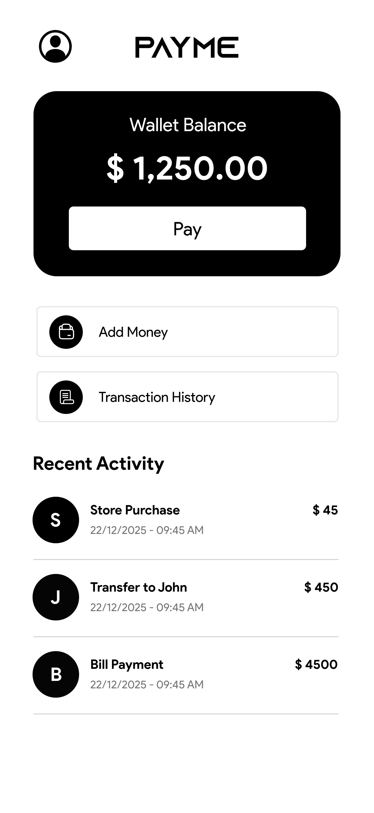
Before moving to pixels, I sketched multiple layouts to test the information architecture. I focused on prioritizing the "Pay" button and ensuring the Balance was the most visible element.
Key Decisions:
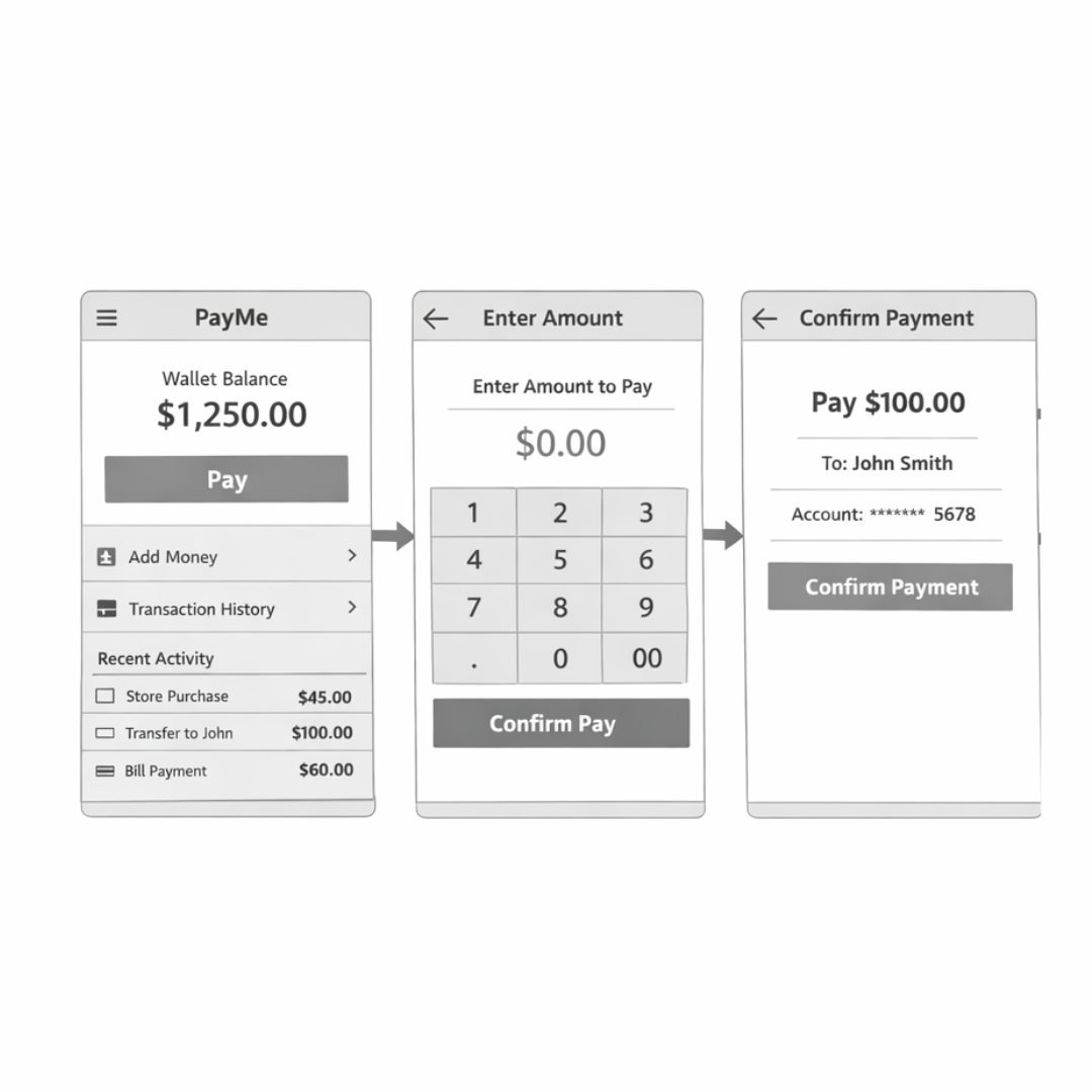
The Fix: Balance is shown clearly at the top with one primary action ("Pay"). Secondary actions are kept minimal.
Impact: Users immediately understand what to do without searching.
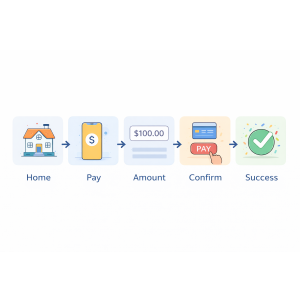
Before: Home → Multiple Options → Pay → Amount → Method → OTP → Status
After: Home → Pay → Amount → Confirm → Success
Impact: Fewer decisions = faster completion + less stress.
The Fix: Distinct visual states for Success, Pending, and Failed. Used human-friendly messages instead of technical error codes.
Impact: Users feel informed and in control.
A look at the high-fidelity screens. The visual language uses blue to signify trust and calmness, with ample whitespace to reduce cognitive load.

I tested the concept with clickable prototypes. The results showed: